This approach helps maintain a clean and minimalist form design, especially useful for forms with multiple fields.
The solution I found leverages the CSS :placeholder-shown pseudo-class combined with the adjacent sibling combinator (+).
This method requires no JavaScript, offering a purely CSS-based solution that’s both simple and effective.
Lets assume our form html looks like that
<form>
  <div>
      <label for="name">Name</label>
      <input type="text" id="name" name="name" placeholder="Name">
  </div>
  <div>
      <label for="email">E-mail</label>
      <input type="email" id="email" name="email" placeholder="E-mail">
  </div>
</form>
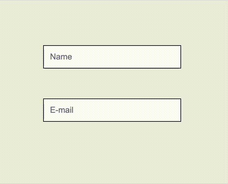
Lets hide labels. So form will look like this now, no label is shown no matter what.
<style>
  ...
  form label {
    display: none;
  }
  ...
</style>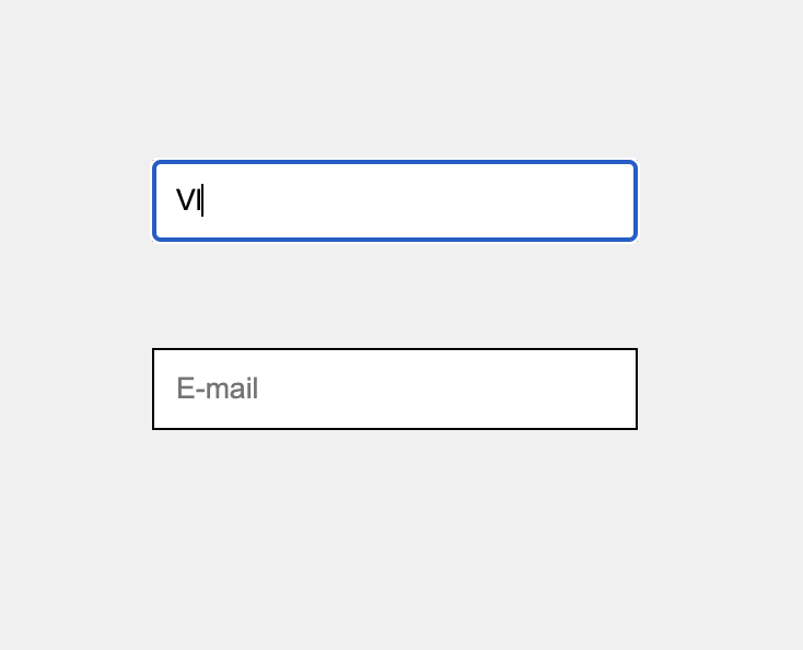
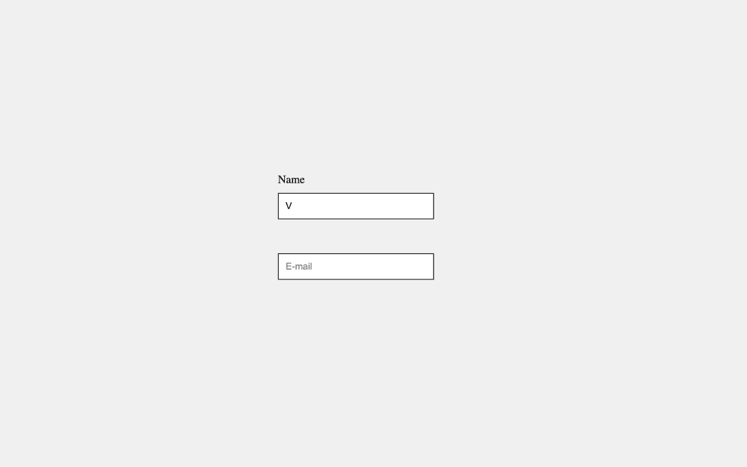
Lets fix that by adding some magic to our css. Now label will be shown as soon as input placeholder will disappear
<style>
  ...
  form label {
    display: none;
  }
  form div label:has(+input:not(:placeholder-shown))  {
    display: block;
  }
  ...
</style>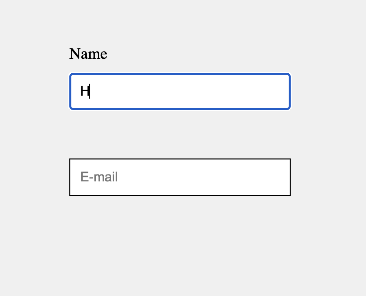
Let’s break down what form div label:has(+input:not(:placeholder-shown)) { display: block; } means:
form div label: This part of the selector targets label elements that are descendants of a div, which itself is a descendant of a form. It’s a way to specify that we’re focusing on labels within forms that follow this particular nesting structure.
:has(+input:not(:placeholder-shown)): This is where the real magic happens, and it’s composed of several parts:
- :has(…): The :has pseudo-class is used to select an element if it matches the condition inside the parentheses. In this case, the condition is related to a sibling input element.
- +: The adjacent sibling combinator. This targets an element that is immediately preceded by the former element. So, label:has(+input) would look for a label that is immediately followed by an input.
- input:not(:placeholder-shown): This selects an input element that does not show its placeholder. The :not() pseudo-class negates the condition inside it, and :placeholder-shown targets input fields that are displaying placeholder text. Together, they select input fields that have content typed into them or have been interacted with in a way that the placeholder is no longer shown.
- { display: block; }: This CSS declaration block will apply the display: block; style to the labels that meet the criteria defined by the selector. Essentially, it means that if the label has a sibling input element where the placeholder is not shown (indicating the user has started filling out the form), then the label will be displayed as a block-level element.
An animated label doesn’t just appear; it catches the eye, guiding the user’s attention in a more dynamic and interactive manner.
Let’s do that:
<style>
...
  form label {
    display: block;
    opacity: 0;
  }
  form div label:has(+input:not(:placeholder-shown))  {
    -webkit-animation: fadeInFromNone 0.5s ease-out forwards;
    -moz-animation: fadeInFromNone 0.5s ease-out forwards;
    -o-animation: fadeInFromNone 0.5s ease-out forwards;
    animation: fadeInFromNone 0.5s ease-out forwards;
  }

  @-webkit-keyframes fadeInFromNone {
    0% {
      opacity: 0;
    }
    100% {
      opacity: 1;
    }
  }
  @-moz-keyframes fadeInFromNone {
    0% {
      opacity: 0;
    }
    100% {
      opacity: 1;
    }
  }
  @-o-keyframes fadeInFromNone {
    0% {
      opacity: 0;
    }
    100% {
      opacity: 1;
    }
  }
  @keyframes fadeInFromNone {
    0% {
      opacity: 0;
    }
    100% {
      opacity: 1;
    }
  }
...
</style>